


Headshot color psychology is the strategic use of color in business portraits to shape perception, signal trustworthiness, and reinforce professional brand identity before a single word is spoken. First impressions form in around 100 milliseconds, which means your wardrobe and background colors are doing heavy lifting the moment someone lands on your LinkedIn profile or website. Blue signals trust. Black communicates authority. Green suggests growth. These are not decorative choices. They are calculated brand decisions, and understanding the science behind them gives business owners and executives a real edge in how they present themselves visually.
How do colors affect perception in business headshots?
Color perception in business portraits operates at a neurological level, not just an aesthetic one. The brain processes visual information before conscious thought kicks in, which means your audience has already formed an emotional response to your headshot before they read your title or credentials. That response is shaped heavily by color saturation, tone, and contrast.
Warm colors like red and orange trigger urgency and energy, while cool colors such as blue and green promote trust and calm. This finding comes from a survey of 137 participants measuring direct emotional and behavioral responses to color hue. For business professionals, this distinction matters because the emotional state you trigger in a viewer affects how they judge your competence and approachability.
“Color choices in headshots are strategic components of an integrated branding message pipeline that includes lighting, composition, and story.” — Psychology of Color in Photography, Adorama
Here is how specific colors translate into perception in a professional portrait context:
- Blue and navy: Signal calm, competence, and reliability. Widely used in banking, healthcare, and legal services for exactly this reason.
- Black: Projects authority, sophistication, and executive presence. Works well for C-suite professionals and consultants.
- Green: Communicates growth, balance, and approachability. A strong choice for coaches, financial advisors, and wellness professionals.
- Gray: Neutral and polished. Pairs well with almost any skin tone and reads as understated professionalism.
- White and light tones: Create openness and clarity. Often used in backgrounds to keep focus on the subject.
Color saturation also plays a role. Highly saturated colors can feel aggressive or distracting in a portrait context, pulling attention away from your face. Muted, tonal versions of the same colors tend to read as more polished and intentional.
Which colors convey trust, authority, and creativity in portraits?
Understanding business portrait color meaning at a practical level means knowing which colors align with the specific qualities you want your audience to associate with you. The table below maps key brand traits to color choices for both wardrobe and background.

| Brand trait | Best color choices | Why it works |
|---|---|---|
| Trust and professionalism | Navy, medium blue, slate | Blue signals calmness and dependable value at decision points |
| Authority and elegance | Black, charcoal, deep burgundy | Dark tones project executive presence and control |
| Growth and innovation | Forest green, teal, sage | Green communicates balance and forward momentum |
| Warmth and approachability | Warm white, soft terracotta, dusty rose | Warm neutrals invite connection without sacrificing polish |
| Creativity and energy | Deep plum, cobalt, warm orange accents | Accent colors signal differentiation when used with restraint |
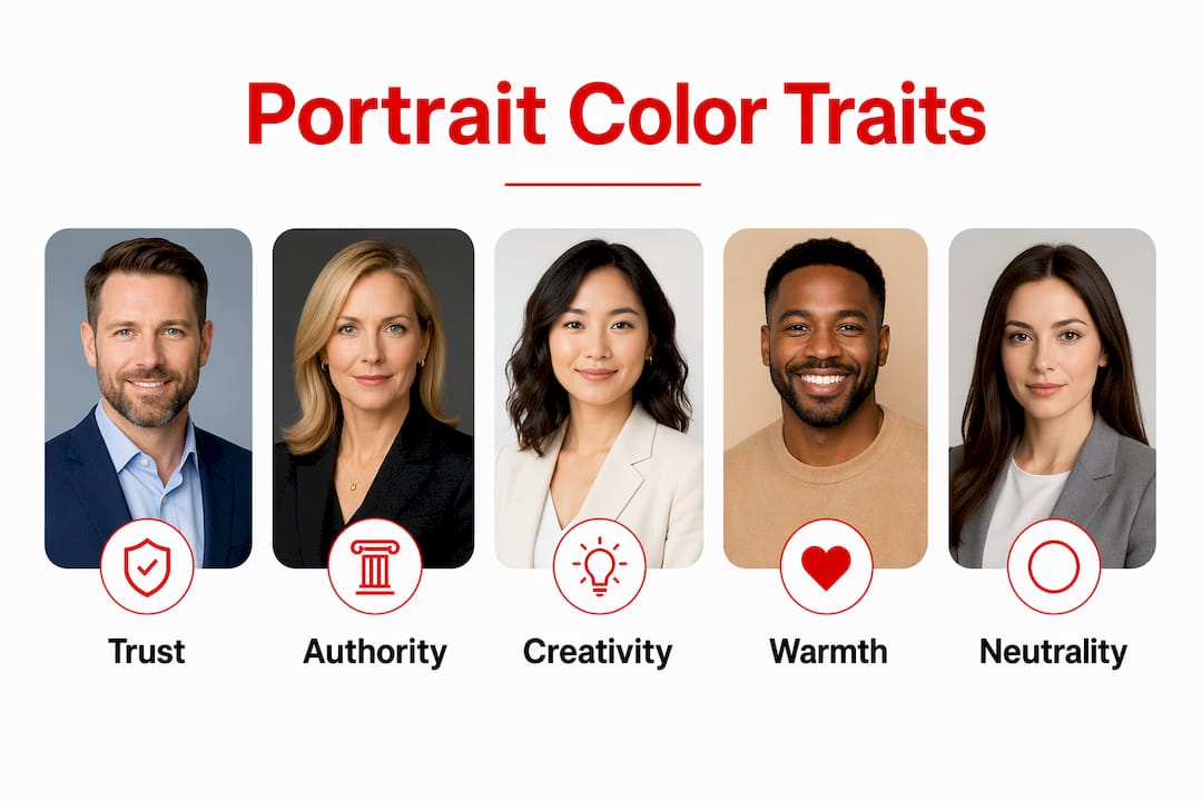
The most cited finding in color psychology research is that blue is the most trustworthy color scheme in professional contexts, recognized consistently across banking, healthcare, and professional services. This is not coincidence. Blue’s power comes from its familiarity in trusted industries, which means it reinforces credibility rather than creating it from scratch.
Black deserves more credit than it typically gets in headshot conversations. Professionals who wear black or photograph against a dark background project authority and focus. The color eliminates visual noise and directs the viewer’s attention to the face and expression, which is exactly where you want it.
Pro Tip: Avoid wearing colors that match your background too closely. When your wardrobe and backdrop blend together, you lose visual definition and the portrait reads as flat. Aim for contrast that separates you from the background while staying within a cohesive tonal range.
Warm accent colors like terracotta or deep orange work well as secondary elements, such as a pocket square, scarf, or subtle background gradient, rather than as dominant tones. They add energy and personality without triggering the urgency response that comes with full saturation.
For a deeper look at wardrobe color choices that translate well on camera, the guidance from Metroplex Headshots covers exactly which tones photograph best across different skin tones and lighting setups.
How to choose colors strategically for your portrait session
Selecting the right colors for your business portrait is not guesswork. It is a process that starts with your brand identity and ends with a coordinated plan covering wardrobe, background, and post-production color grading. Here is how to approach it:
Define your brand personality first. Before you pick a shirt color, write down three words you want clients to associate with you. Trust, authority, and approachability each point to different color families. Let those words drive your choices.
Audit your existing brand assets. Look at your website, logo, and marketing materials. Your headshot colors should complement that palette, not clash with it. If your brand uses deep navy and white, a headshot in a warm red blazer creates visual drift across your platforms.
Match colors to your industry’s expectations. A corporate attorney and a creative director have different audience expectations. Cultural differences also significantly influence color associations, so if you work with international clients, research how your chosen colors read in their context.
Coordinate with your photographer before the session. Share your brand colors, your wardrobe options, and your background preferences in advance. A skilled photographer can adjust lighting temperature and background tone to make your chosen colors land exactly as intended.
Bring two or three wardrobe options. Even with careful planning, colors can shift under studio lighting. Having alternatives gives you flexibility without derailing the session.
Plan for platform consistency. Your headshot will appear on LinkedIn, your website, email signatures, and speaker bios. Consistent background tones and color grading across all your portraits contribute significantly to brand coherence and perceived trustworthiness.
Pro Tip: Lock in a repeatable color palette combining your wardrobe, background, and post-production grading. When you update your headshot in two years, that palette gives your audience seamless brand continuity even if the photographer or location changes.
The impact of color in headshots compounds over time. Every touchpoint where a client sees your portrait reinforces or undermines the perception you are building. Getting the colors right from the start means every impression works in your favor.
What are common mistakes when applying color psychology in portraits?
Color psychology is a powerful tool, but it is also easy to misapply. The most common mistakes professionals make fall into a few predictable patterns.
Treating color as a substitute for quality. Wearing the right color in a poorly lit, low-resolution portrait does not produce trust. Color choices work within a broader photographic message pipeline that includes composition and lighting. Color amplifies quality. It does not replace it.
Ignoring industry and audience context. A financial advisor photographed in a bright orange blazer may signal creativity, but it can undercut the stability and reliability their clients are actually looking for. Always filter color choices through your audience’s expectations, not just your personal preference.
Using overly saturated or neon colors. Highly saturated tones distort under studio lighting and can create unflattering color casts on skin. They also read as visually aggressive, which works against the calm authority most business professionals want to project.
Inconsistency across portrait updates. Subtle color variations can unintentionally undermine trust if your headshots shift in tone, background color, or grading from one update to the next. Professionals who standardize these elements maintain stronger audience recognition.
Neglecting facial expression and composition. Color sets the emotional tone, but expression and framing close the deal. A perfectly chosen navy blazer paired with a closed, tense expression still communicates the wrong message. Color and expression must work together.
Misreading warm colors as universally positive. Warm colors like red and orange increase energy and urgency, which is not always the response you want. In industries where calm and measured judgment are the selling points, warm dominant tones can work against you.
The professionals who get the most from color theory for business portraits treat it as one layer of a coordinated strategy, not a standalone fix. Every element of the portrait, from lighting to expression to background, carries meaning. Color is the layer that sets the emotional context for all of it.
Key takeaways
Color in business portraits is a nonverbal signal that shapes trust, authority, and brand recognition before a viewer reads a single word about you.
| Point | Details |
|---|---|
| First impressions are instant | Color perception forms within 100 milliseconds, making wardrobe and background choices high-leverage brand decisions. |
| Blue leads for trust | Blue signals calmness and competence, making it the strongest color choice for professionals in trust-dependent industries. |
| Consistency builds recognition | Standardizing wardrobe, background, and color grading across portrait updates strengthens brand coherence over time. |
| Color amplifies quality | Color psychology works only when paired with strong photographic quality, including lighting, composition, and expression. |
| Match color to your audience | Industry norms and cultural context shape how colors are interpreted, so filter every choice through your client’s expectations. |
Why I think most professionals underestimate color’s role in their headshots
I’m Traci Schowmeyer, and after working with hundreds of business professionals on their portraits, the pattern I see most often is this: executives spend significant time on their wardrobe and almost no time thinking about what that wardrobe communicates at a psychological level.
Most people choose colors they personally like or feel comfortable in. That is a reasonable starting point, but it is not a branding strategy. I have had clients walk in wearing a color that directly contradicts the brand they have spent years building. A consultant who positions herself as a calm, steady authority figure showed up in a saturated coral blazer because it was her favorite. The portrait was technically beautiful. But it sent the wrong signal to her audience.
What I have found actually works is a pre-session color audit. Before we ever pick up a camera, I ask clients to pull up their website, their LinkedIn banner, and their most recent marketing materials. We look at the palette together and identify the two or three colors that appear most consistently. Then we build the headshot around those colors, not around what happens to be hanging in the closet that week.
The other thing I push back on is the idea that color psychology is a one-time decision. Your personal branding headshots should evolve with your brand, but the color palette should stay recognizable. That continuity is what builds the visual familiarity that makes audiences trust you before they have even read your bio.
Color is the digital handshake your portrait extends before you say a word. Make sure it is saying the right thing.
— Traci Schowmeyer
Let Metroplex Headshots put your brand’s best colors to work
At Metroplex Headshots, every portrait session starts with a conversation about your brand, your audience, and the impression you want to make. Color strategy is built into that process from the beginning, not added as an afterthought.

Whether you are a business owner building a personal brand or an executive updating your professional image, the team at Metroplex Headshots brings together color psychology, lighting expertise, and technical precision to produce portraits that work as hard as you do. Explore the difference between headshots and business portraits to find the right session format for your goals, or go deeper with the business portrait guide to understand exactly what a strategic portrait session can do for your brand.
FAQ
What is headshot color psychology?
Headshot color psychology is the deliberate use of color in business portraits to influence how viewers perceive your trustworthiness, authority, and professional identity. Colors like blue, black, and green each carry specific psychological associations that shape first impressions formed in under 100 milliseconds.
What color should I wear for a professional headshot?
Navy and medium blue are the strongest choices for professionals in trust-dependent industries because blue signals calmness and competence. Black works well for executives seeking to project authority, while green suits professionals in growth-oriented or wellness fields.
Does background color matter in a business portrait?
Background color directly affects the emotional tone of your portrait and how your wardrobe colors read on camera. A neutral gray or deep charcoal background keeps focus on your face, while a white background creates openness. Consistency in background tone across portrait updates also strengthens brand recognition.
Can the wrong color undermine a professional headshot?
Overly saturated or neon colors distort under studio lighting and can read as visually aggressive, which works against the calm authority most business professionals need. Warm dominant tones like red and orange signal urgency rather than stability, which can conflict with the trust signals that many industries require.
How often should I update my headshot colors?
Update your headshot when your brand identity shifts, but keep your core color palette consistent across updates. Stable color themes across portrait sessions reduce visual drift and maintain the audience recognition you have built over time.

