


A professional photo business card is defined as a printed networking card that features a high-quality headshot alongside your contact details, creating an immediate visual identity that a text-only card cannot replicate. For client-facing professionals, this format is the secret sauce of personal branding. Photo business cards produce 100% higher trust and recognition compared to faceless cards. That statistic means a prospect who receives your card is twice as likely to remember you and feel confident reaching out. Real estate agents, executive coaches, consultants, and financial advisors all depend on personal likability to close business. For those professionals, a card with a face is not optional. It is a core brand asset. Metroplex Headshots works with exactly these professionals to produce headshots built for this purpose.
What makes a professional photo business card work?
A photo business card works because it turns a passive piece of paper into a personal introduction. When someone picks up your card hours or days after meeting you, your face triggers the memory of that conversation. A logo cannot do that. Branding experts confirm that photos outperform logos when the individual is the brand’s core asset. A corporate retail brand sells a product, so a logo makes sense. A consultant, coach, or agent sells themselves first, and a photo card reflects that reality.
The emotional connection a photo creates is also measurable in behavior. Recipients are more likely to keep a card with a face on it because it feels personal rather than generic. Photo-centric cards perform best in networking-heavy professions where trust is built face to face. That means conferences, client lunches, and referral introductions are all moments where your photo card does work long after you leave the room.
“People buy from people they know, like, and trust. Your photo on a business card is the fastest shortcut to all three.”
There are situations where a logo still belongs on the front of a card. Large corporate teams, franchise operations, and retail brands benefit from logo-forward designs because the company identity matters more than any single employee’s face. But if you are building a personal brand, a photo is the stronger choice every time.
- Real estate agents and brokers
- Executive coaches and business consultants
- Financial advisors and wealth managers
- Speakers, trainers, and personal development professionals
- Independent attorneys and healthcare practitioners
Design standards and technical requirements for photo cards
Print quality lives or dies at the file preparation stage. Professional photos must be at least 300 DPI for print to avoid pixelation that visibly damages credibility. A photo that looks sharp on your phone screen at 72 DPI will appear blurry and unprofessional when printed at business card size. Always request your final image file in high resolution before sending it to any printer.
Layout hierarchy and spacing rules
Typography on a business card follows a strict three-tier hierarchy. Font sizes should be set at 10–12 pt for your name, 8–10 pt for your title, and 8–9 pt for contact details. Using three distinct sizes creates visual order and tells the reader where to look first. Cramming everything into one font size forces the eye to work harder and reduces the card’s perceived quality.
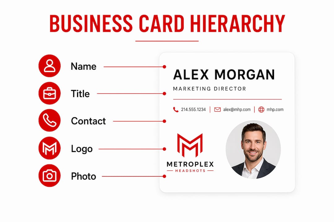
Bleed is the invisible margin that protects your design from mechanical cutting errors. Photos and backgrounds must extend 0.125 inches beyond the trim line on all sides. Without bleed, a slightly off-center cut leaves a white edge that makes the card look unfinished.
Common design pitfalls to avoid
- Overcrowding the layout. Fitting every credential, social handle, and tagline onto one card destroys readability. Pick your top five contact points and stop there.
- Ignoring white space. Effective white space covers 25–35% of the card and is a deliberate design feature, not wasted space. It allows your photo and name to breathe and stand out.
- Using low-contrast color combinations. Dark text on a dark background, or light text on a light photo, makes the card unreadable in dim lighting.
- Skipping color calibration. Colors on screen use RGB values. Print uses CMYK. Converting your file to CMYK before sending it to the printer prevents unexpected color shifts.
| Design element | Recommended standard |
|---|---|
| Photo resolution | 300 DPI minimum |
| Name font size | 10–12 pt |
| Title font size | 8–10 pt |
| Contact info font size | 8–9 pt |
| Bleed margin | 0.125 inches on all sides |
| White space | 25–35% of total card area |
Pro Tip: Treat white space as a design element you are actively placing, not empty area you forgot to fill. Cards with generous white space consistently read as more premium than cards packed with information.
How to select and prepare your photo for a business card
The photo you choose carries more weight than any other element on the card. Stock photos fail to build genuine trust and create brand inconsistency because they represent no real relationship. A prospect who later meets you in person and finds you look nothing like a stock image loses confidence immediately. Your photo must be you, taken professionally, and current within the last two years.

A strong business card photo shares four characteristics. The lighting is even and flattering, with no harsh shadows across your face. The background is clean and neutral or on-brand, never distracting. Your expression is approachable and confident, not stiff or overly formal. The crop places your face and shoulders in the frame with enough room to integrate cleanly into the card layout.
Pro Tip: Ask your photographer to deliver the final file in both CMYK and sRGB color spaces. The CMYK version goes to your card printer. The sRGB version works for digital use on LinkedIn or your website.
Use this checklist before approving your photo for print:
- Resolution is 300 DPI or higher at the intended print size
- File format is TIFF or high-quality JPEG, not a compressed web export
- Color space is converted to CMYK for print
- Background does not compete with your face or the card’s text elements
- Expression and attire align with your brand and industry
Metroplex Headshots specializes in executive presence photography that produces images built for exactly this kind of multi-channel use. A single session delivers files ready for business cards, LinkedIn, and your website without requiring separate shoots.
What creative layout and printing options increase impact?
The physical feel of your card communicates brand quality before the recipient reads a single word. Matte and soft-touch finishes reduce glare and make photos appear richer and more professional than glossy alternatives. A glossy finish can wash out skin tones and create reflections that obscure your face in certain lighting conditions.
Specialty finishes add perceived value but come with a real cost consideration. Soft-touch coatings and foil stamping can raise production costs by 50–100% compared to standard printing. The trade-off is that recipients keep premium cards longer, which improves the return on your investment over time. For professionals who hand out cards at high-value networking events, that retention rate matters.
| Finish type | Best use case | Cost impact |
|---|---|---|
| Matte coating | Photo-forward cards, all industries | Low |
| Soft-touch coating | Premium personal brands, consultants | Medium |
| Spot UV | Highlighting name or logo on dark cards | Medium |
| Foil stamping | Luxury brands, high-end service providers | High |
Layout styles that integrate photos well include the full-bleed back design, where your photo covers the entire back of the card, and the side-panel layout, where your photo occupies the left third of the front face. Both approaches give the photo prominence without crowding your contact information. For guidance on creative headshot ideas that translate well to card formats, reviewing current professional photo examples helps you plan your session with the final card layout in mind.
When choosing a printer, request physical samples before placing a full order. Color rendering varies significantly between print vendors, and a sample run protects you from receiving 500 cards with an off-color photo.
Key takeaways
A professional photo business card doubles trust and recognition for client-facing professionals, but only when the photo meets print-quality standards, the layout follows proven hierarchy rules, and the card stock reinforces the brand impression you want to leave.
| Point | Details |
|---|---|
| Photo doubles recognition | Cards with professional headshots produce 100% higher trust and recall than text-only cards. |
| 300 DPI is non-negotiable | Any photo below 300 DPI will appear pixelated in print and undermine your credibility. |
| White space is intentional | Keep 25–35% of the card clear to improve readability and signal a premium brand. |
| Finish affects retention | Soft-touch and specialty coatings cost more but keep your card in recipients’ hands longer. |
| Photo must be authentic | Stock photos and outdated headshots break trust when prospects meet you in person. |
Why I think most professionals underinvest in this one tool
I’m Traci Schowmeyer, and after years of working with professionals on their personal branding photography, the pattern I see most often is this: someone spends real money on a website, a logo, and a brand color palette, then hands out a business card with a blurry photo taken at a company event three years ago. The card undoes everything else.
The uncomfortable truth about photo business cards is that the photo quality signals your standards to the recipient. A pixelated, poorly lit image does not just look bad. It tells the person holding your card that you accept “good enough” in your work. That is not the message any professional wants to send. I have watched clients go back and reprint entire card orders after seeing the difference a properly lit, professionally retouched image makes on the final product.
The design mistakes I see most often are overcrowding and wrong finish choices. Professionals try to include every credential, every social handle, and a tagline all on a 3.5 by 2 inch card. The result is visual noise that no one reads. Strip it back. Let the photo and your name do the heavy lifting. The card’s job is to get someone to remember you and reach out. It does not need to be your full biography.
Trends in print networking tools are moving toward premium materials and minimal text. The professionals who stand out at events in 2026 are handing over cards that feel different before they are even read. Soft-touch coating, a clean layout, and a confident headshot create a physical brand experience that a digital connection cannot replicate. Invest in the photography first. Everything else follows from that foundation.
— Traci Schowmeyer
How Metroplex Headshots helps you get the card right
Your business card is only as strong as the photo at its center. Metroplex Headshots produces professional headshots built for personal branding that meet print standards and translate cleanly across every format you need, from business cards to LinkedIn to your website.

Every session is designed around your industry, your brand positioning, and the impression you want to leave with clients. Metroplex Headshots also guides you on headshot session preparation so you arrive camera-ready and leave with files that work immediately. If you are ready to build a card that actually represents your brand, schedule your session with Metroplex Headshots today.
FAQ
What is a professional photo business card?
A professional photo business card is a printed networking card that features a high-quality headshot alongside your name, title, and contact details. It is the standard format for client-facing professionals who build trust through personal relationships.
What photo resolution do I need for a business card?
Your photo must be at least 300 DPI at the intended print size. Anything lower will appear pixelated when printed, which damages your professional credibility.
Should I use a photo or a logo on my business card?
Use a photo when you are the brand, such as in coaching, consulting, real estate, or financial advising. Use a logo when your company identity matters more than your individual face, such as in corporate or retail settings.
What finish works best for photo business cards?
Matte and soft-touch finishes work best for photo cards because they reduce glare and make skin tones appear richer. Glossy finishes can wash out photos and create reflections that obscure your face.
How much white space should a business card have?
A well-designed business card keeps 25–35% of its surface free of text and images. That open space improves readability and signals a premium, professional brand to the recipient.

