


Use a white background when you need a clean, widely reusable portrait for a team page, press kit, or a corporate LinkedIn profile, but only if you can control contrast through wardrobe and lighting. If your skin tone, hair color, or wardrobe runs light, a soft light gray backdrop will almost always photograph better and save you a retouching headache later.
TL;DR:
- Achieving a true white background depends on proper separation and lighting ratio, requiring background lights 1 to 2 stops brighter than the subject’s face.
- Proper setup involves keeping at least 5 to 6 feet between the subject and backdrop, and using two lights at 45 degrees aimed at the background.
- For consistency, it is crucial to standardize background and crop across a team, with gray backgrounds offering more forgiving options for diverse skin tones and wardrobe.
- Wearing mid-tone or darker solid clothing prevents blending into the background, especially for fair or light skin tones, which are better suited to light gray backgrounds.
- In post-production, verify the background reads close to RGB 255, 255, 255, and make incremental adjustments to ensure the backdrop is pure white without sacrificing skin tone detail.
Table of Contents
- Is a White Background Headshot Right for Your Situation?
- Setting Up a Studio for a True White Backdrop
- What Camera Settings Actually Blow Out the Background?
- What Should You Wear for a White Backdrop?
- How Should You Pose and Crop for Small Thumbnails?
- Confirming True White in Post-Production
- Quick Fixes for the Most Common White Background Problems
- Why Trust This Guide?
- What Most Headshot Advice Gets Wrong About White Backgrounds
- Ready for a Headshot That Actually Looks Right?
- Sources
Is a White Background Headshot Right for Your Situation?
White works best when consistency and versatility matter more than dramatic styling. It reads as neutral, professional, and instantly recognizable, which is why it dominates so many corporate and personal branding contexts where photos get repurposed across a website, a press release, and a conference program all at once.
Here’s a quick way to decide:
- Choose white for press headshots, standardized team portraits, speaker bios, and directories where every photo needs to match.
- Choose light gray or off-white if you have fair skin, wear predominantly light or white clothing, or have very light hair, since white backdrops can wash out those combinations.
- Choose gray as your default if you photograph a team with mixed skin tones and wardrobe styles, since neutral gray tends to flatter a wider range of people and cuts down on glare.
- Run this checklist before booking: confirm your wardrobe has contrast, check whether the platform you’re posting to uses a light or dark theme, and decide if the whole team needs to match one background standard.
If you manage a group shoot, standardizing your team’s background and crop matters more than which exact neutral you pick, since consistency reads as professionalism even when individual tones vary slightly.
Setting Up a Studio for a True White Backdrop
Getting a background that photographs as pure white, not gray, comes down to separation and light ratio, not the paper itself.
- Pick your backdrop material. A seamless paper roll (9 feet wide is standard) gives the cleanest edge-to-edge white. Muslin wrinkles easily and often reads slightly warm; vinyl holds up better for repeated location shoots but shows footprints if you’re not careful.
- Set your clearance. Keep the subject at least 5 to 6 feet from the backdrop. This distance keeps shadows off the paper and lets your background lights spread evenly without spilling onto the subject.
- Place your background lights. Two strobes or continuous lights, one on each side, aimed at the backdrop at roughly 45 degree angles, do the job. Set them 1 to 2 stops brighter than your subject lighting so the paper blows out to true white instead of settling into gray.
- Light the subject separately. A key light at 45 degrees, a fill to soften shadows, and an optional rim or hair light will keep the face three-dimensional even against a blown-out background. Use softboxes or umbrellas to avoid spill onto the backdrop from the subject side.
- Adapting on location. For office or event shoots, a portable seamless backdrop stand and two small strobes or LED panels can replicate this setup in a conference room, though you’ll need to control ambient window light carefully.
Without that separation and background-light ratio, a “white” backdrop almost always records as gray or uneven on camera, no matter how white the paper looks in person.
Pro Tip: If you don’t have a light meter, take a test shot and check the histogram. If the background spike sits short of the right edge, add power to your background lights rather than trying to fix it in editing.
What Camera Settings Actually Blow Out the Background?
The rule photographers rely on is simple: meter for the face first, then adjust the background lights until they read 1 to 2 stops hotter on your meter or histogram. That gap is what turns paper into pure white without turning skin into a flat, overexposed mess.
A workable starting point for studio strobes: ISO 100, f/8, shutter at 1/125. Meter the subject’s face with an incident meter, dial in your key and fill lights to match that exposure, then increase your background strobes until they read one to two stops brighter on the same meter. For continuous LED panels, the process is identical, just monitored live on your camera’s histogram instead of a handheld meter.
A few checks worth building into every session:
- Watch for highlight clipping on skin, not just the background, using your camera’s zebra pattern or histogram warning.
- Use a spot meter reading directly off the forehead and cheek to confirm skin tone isn’t blown out even as the background is.
- If you’re shooting on a phone, lock exposure and focus manually (tap and hold, then drag the exposure slider) rather than letting automatic HDR blend multiple frames, which tends to flatten facial contrast and warm skin tones unpredictably.
- Shoot RAW whenever the camera or phone allows it, since RAW files hold far more recoverable highlight and shadow detail during editing.
That 1 to 2 stop gap between subject and background exposure is the single most reliable number in this entire process. Get that ratio right and most of your post production problems disappear before you ever open an editing program.
What Should You Wear for a White Backdrop?
Skip pure white or very pale tops. A white shirt against a white backdrop erases the line between your body and the background, forcing a retoucher to rebuild an edge that should have been clean in camera. Mid-tone or darker solids, navy, charcoal, deep green, burgundy, give the retoucher a clear edge to work with and photograph better regardless of your skin tone.
Skin tone should factor into your background choice too, not just your wardrobe:
- Fair or light skin tones often photograph better against light gray than pure white, since the contrast between skin and background is naturally lower on white and can make the face look washed out.
- Medium skin tones generally have the most flexibility and work well on either white or gray.
- Deep skin tones tend to pop against white, since the contrast is strong and clean, though a slightly warmer light gray can also work well.
Stick to solid colors and skip busy patterns, which create distracting texture at small crop sizes; for tips on colors that boost your brand’s perception, consider the psychology of colors in marketing. A structured blazer or collared shirt reads as polished on camera in a way that soft knits often don’t.
Pro Tip: Bring two outfit options to any session; a solid mid-tone top and a slightly different neutral. It gives your photographer a fallback if the first choice photographs closer to the background color than expected under studio lights.

For a deeper breakdown of colors and fabrics to avoid entirely, wardrobe guidance built specifically for headshot sessions is worth reviewing before you shop.
How Should You Pose and Crop for Small Thumbnails?
Most headshots get viewed as tiny thumbnails, not full-screen portraits, so the crop needs to hold up at a fraction of its original size.
- Crop tight but not too tight. A head-and-shoulders crop with a little room above the head and below the collarbone tends to translate well across platforms, from a company directory to a LinkedIn circle crop.
- Angle your shoulders slightly off-axis rather than squaring up to the camera, and keep your chin level, neither tilted up nor tucked down, so the jawline stays defined.
- Test the crop at actual display size. Shrink the final image down to the size it’ll actually appear at, whether that’s a 400 pixel LinkedIn profile photo or a 150 pixel team directory thumbnail, before calling it final.
- Make micro-adjustments if the eyes get lost. If the face reads as a blur at thumbnail size, tighten the crop slightly or increase contrast a touch, since small profile images depend heavily on eye and facial definition to register at all.
Confirming True White in Post-Production
Before you export anything, sample the background with your editing software’s color picker. True white should read close to RGB 255, 255, 255 across all three channels; if you’re consistently seeing values in the 230s or lower with a color shift, the background is reading gray or off-white and needs correction, not just a brightness bump.
A few fixes come up constantly at this stage:
- Use a curves or levels adjustment targeted only at the background, not a global exposure boost that will blow out skin highlights along with the paper.
- Feather your selection edges carefully when isolating the background for correction, since a hard edge creates a visible halo around hair and shoulders.
- Check for color casts, a slightly warm or cool tint, that can creep in from ambient light or mixed color temperatures between your key light and background lights.
- Avoid clipping the background to pure white in a single aggressive move; small incremental adjustments preserve subtle shadow detail near the subject’s edges.
For export, save web versions as sRGB JPEGs at reasonable compression, quality settings around 80 to 90 percent balance file size against visible artifacts. Print files should stay in a higher-resolution TIFF or high-quality JPEG format, ideally at 300 dpi, since print reveals compression artifacts that a screen never will. Keep a full-resolution master file archived separately from your web-ready exports, since resizing down is always easier than trying to upscale a compressed thumbnail later.
Quick Fixes for the Most Common White Background Problems
Background reading gray instead of white? Add more background light power or increase the distance between subject and backdrop before touching anything in editing.
Skin looking washed out? Rebalance your key and fill lights to favor the subject, then confirm your background lights aren’t spilling forward onto the face.
Seeing halos around hair or shoulders? Back off aggressive sharpening and recheck your selection edges for hard, unfeathered clipping.
Clothing blending into the background? That’s a wardrobe problem, not an editing one. Retake with a mid-tone top, or use selective masking as a last resort rather than a first fix.
Why Trust This Guide?
This guide comes from Metroplex Headshots, an active photography studio that shoots corporate, executive, and personal branding headshots across in-studio and on-location sessions every week. The team behind it, including photographer Traci Schowmeyer, builds these recommendations from real session workflows, not theory.
Professional headshot services may include mobile studio options for offices and events, professional retouching, background editing, and fast image delivery, so the technical steps above reflect what actually happens behind the camera. For session prep specifics, wardrobe and posing guidance covers what to bring and wear before your appointment.
What Most Headshot Advice Gets Wrong About White Backgrounds
Most headshot advice treats white as the default and gray as the compromise. That’s backwards. White is the harder background to execute correctly, and it punishes small mistakes, an underlit backdrop, a pale shirt, fair skin without enough contrast, in ways gray simply doesn’t. Gray forgives more. White demands more precision in exchange for a cleaner, more versatile final image.
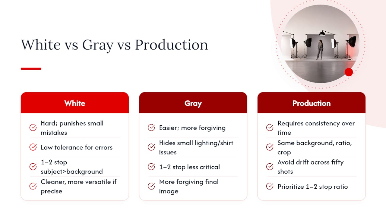
The conventional advice also underweights consistency. A company rolling out fifty employee headshots doesn’t need the “best” background in isolation; it needs the same background, lighting ratio, and crop applied fifty times without drift. That’s a production discipline problem, not an aesthetic one, and it’s where most DIY attempts fall apart even when any single photo looks fine on its own.
If you take one thing from this guide, prioritize the light ratio between subject and background before you worry about wardrobe or pose. Get that 1 to 2 stop separation right, and most of the downstream problems, gray backdrops, washed-out skin, awkward retouching, never show up in the first place.
— Traci Schowmeyer
Ready for a Headshot That Actually Looks Right?
DIY white background setups fail most often on the light ratio, not the camera, which is exactly the part a home studio setup struggles to replicate consistently. A professional headshot service handles that technical work for you, in-studio or on-location through a mobile studio for offices and teams, with professional retouching and background editing included so the final image is genuinely ready to use, not a project you have to fix yourself.

A booked session may include real-time image review, so you see the lighting and background before you leave, plus fast delivery once your final files are selected. If you’re deciding between a formal headshot and a more relaxed portrait style, Metroplex Headshots’ guide to session types can help you pick the right one before you book. Ready to get a background that reads true white the first time? Schedule a professional headshot session and skip the trial and error entirely.

