Black and white headshots are a professional, defensible choice when the lighting, wardrobe, and retouching are handled with intention rather than a one-tap filter. Fit matters more than fashion: check your industry norms and where the image will actually live before you commit. The single best move is to shoot RAW in color and evaluate both a color and a black-and-white conversion side by side before you decide.
TL;DR:
- Black and white headshots work best for authoritative or timeless industries such as law, executive leadership, and press, rather than casual or consumer-facing roles.
- Proper lighting patterns like Rembrandt and butterfly are crucial to create depth and flattering features, with lens choice and contrast built in-camera, not in post-production.
- Clothing should focus on value and contrast, avoiding small patterns or shiny finishes, while backgrounds should be simple or textured to enhance facial focus.
- Shooting in color and controlling individual channels yields a more refined gray scale conversion than simple desaturation, with retouching preserving skin texture for authenticity.
- Professional photography with intentional lighting and review ensures monochrome portraits look deliberate, not accidental, especially in contexts requiring authority or consistency.
Table of Contents
- When Should You Choose Black and White Over Color Headshots?
- How Do You Light and Shoot for a Black-and-White Conversion?
- What Wardrobe and Background Choices Work Best in Monochrome?
- How Do You Convert and Retouch a Headshot to Black and White?
- Where Do Black-and-White Headshots Perform Best?
- What Mistakes Should You Avoid Before a B&W Shoot?
- Why Does Hiring a Professional Matter for Black-and-White Headshots?
- An Editorial Take on the Monochrome Trend
- Book a Black-and-White Session With Metroplex Headshots
- Sources
When Should You Choose Black and White Over Color Headshots?
Monochrome tends to read as authoritative and timeless, which is why it shows up so often in executive branding and press bios. Stripping out color pulls attention straight to bone structure, expression, and eyes, which is exactly what a speaker bio or a law firm partner page wants.
B&W tends to perform well for:
- Executives and C-suite leaders building a gravitas-driven personal brand
- Attorneys and financial professionals, where formality and trust outweigh warmth
- Authors, speakers, and press headshots, where timelessness matters more than trend
- Creative professionals using a portfolio-style image as a signature look
Color usually wins for sales roles, real estate agents, and any consumer-facing brand where warmth and approachability drive the first impression. Retail, hospitality, and healthcare front-desk staff generally photograph better in color because clients respond to skin tone and warmth cues.
If your company has a team page, pick one style and stick with it. A rule of thumb worth following: keep both versions on file. A LinkedIn banner might call for color while a printed program for a speaking engagement calls for black and white.
How Do You Light and Shoot for a Black-and-White Conversion?
Black-and-white headshots live or die on lighting pattern, not on color grading later. Two classic setups do most of the work:
- Rembrandt lighting places the key light at a 45-degree angle, creating a small triangle of light on the shadowed cheek. It carves out jawlines and adds dimension that reads as confident and grounded.
- Butterfly lighting sits the light directly above and in front of the face, casting a small shadow under the nose. It flatters most face shapes and gives a cleaner, more editorial look.
- High-key setups (bright, low-contrast) feel modern and approachable; low-key setups (darker, higher-contrast) feel dramatic and powerful. Testing both during one session gives you options for different placements.
Lens choice matters more in B&W because there is no color to distract from distortion. A focal length between 85mm and 135mm on a full-frame camera keeps facial proportions natural and avoids the wide-angle warping that creeps in below 50mm. Shoot around f/4 to f/5.6 for enough depth to keep ears and shoulders sharp, and keep ISO as low as your light allows. Noise reads as texture loss the moment you desaturate, and you lose midtone detail you cannot get back.
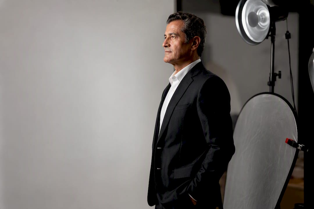
Meter for the highlights on the forehead and cheekbones, not an average of the frame. A beauty dish with a grid gives you a soft, contained key light with a subtle vignette that pulls focus to the face. Add a low-power fill card or reflector opposite the key to hold detail in the shadow side. This is also where modifier choice and lighting setups make the biggest visible difference in the final grayscale image.
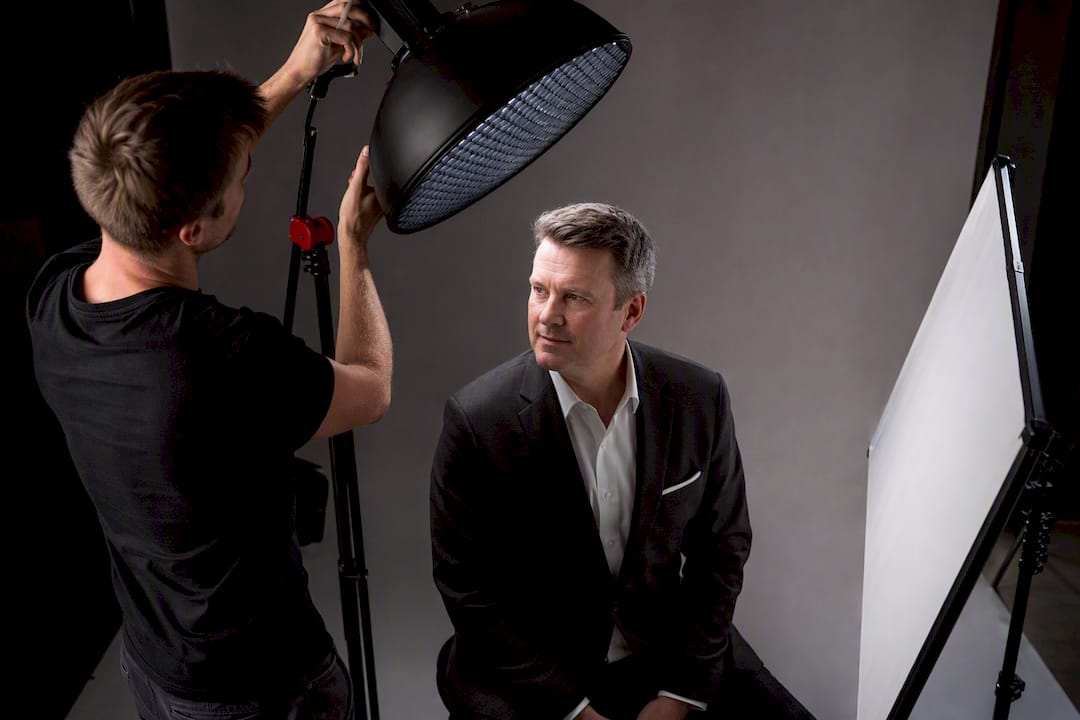
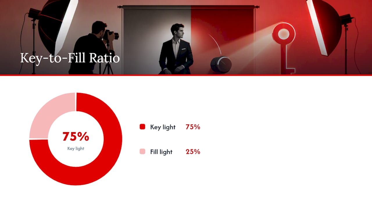
Pro Tip: Build your contrast in-camera with your lighting ratio, not with sliders later. A three-to-one ratio between key and fill photographs beautifully in black and white; pushing contrast in post on a flat, evenly lit file just crushes shadows and blows highlights.
What Wardrobe and Background Choices Work Best in Monochrome?
Color disappears in a B&W conversion, so what actually matters is value. A navy suit and a black suit look nearly identical once desaturated. Think in terms of light, medium, and dark tones instead of hues, and make sure your clothing separates clearly from your skin tone rather than blending into it.
A few rules that hold up in almost every session:
- Skip small checks, herringbone, and tight pinstripes. They can create a moiré shimmer once converted.
- Solid colors in mid to dark values photograph more cleanly than prints.
- Matte skin finishes hold texture better than heavy powder, which can flatten highlights on the forehead and nose.
- Groomed brows and a light lip balm keep features defined without adding shine that blows out under studio light.
Backgrounds carry more weight in monochrome because texture becomes more visible once color is removed. A textured backdrop can add depth, but a plain, evenly lit gray or charcoal background usually keeps focus locked on the face, which is often the safer choice for corporate use. Some background options and tonal separation techniques create the kind of authority a black backdrop signals.
How Do You Convert and Retouch a Headshot to Black and White?
Shoot in color, always. Converting from a full-color RAW file gives you access to individual red, green, and blue channels, and adjusting how each channel translates to gray is what separates a professional conversion from a flat desaturation. A simple “remove color” slider treats every hue the same and often muddies skin tones.
A cleaner workflow looks like this:
- Start from the color RAW master and use channel mixing (not a one-click desaturate) to control how skin, hair, and background separate into gray values.
- Shape contrast with curves and local dodge and burn rather than a global contrast filter, which tends to crush detail rather than build it.
- Retouch skin with texture preservation in mind: reduce blemishes, but keep pores and fine lines visible so the face does not look plastic.
- Dodge the eyes slightly and burn the edges of the frame to draw focus inward.
- Export a high-resolution TIFF or JPEG for print and a compressed sRGB JPEG for web and LinkedIn.
Selective dodging and burning, rather than one blanket adjustment, is what preserves natural skin texture across different skin tones without blowing highlights or flattening shadows. Keep your original color RAW file. If a client later needs a color version for a different platform, you will need that master, not the converted grayscale export.
One practitioner review that anonymously rated 240 headshots found black-and-white portraits performed equally or better than color on measures like perceived competence and memorability, but only when the conversion looked intentional rather than like an afterthought.
Where Do Black-and-White Headshots Perform Best?
Placement should drive your final choice more than personal preference. Some platforms reward the monochrome look; others neutralize it.
- LinkedIn and speaker bios benefit from the timeless, distraction-free look B&W provides.
- Press kits and media pages often default to black and white because it ages well and reproduces cleanly in print.
- Team pages should stay consistent. Mixing B&W and color headshots on the same page reads as disorganized.
- Websites with strong brand colors may do better in color, since a monochrome image can clash with a colorful layout.
If you are unsure, test it. Swap your LinkedIn profile photo between a color and a B&W version for a few weeks each and track profile views or connection requests. That kind of simple A/B comparison tells you more than any style guide.
What Mistakes Should You Avoid Before a B&W Shoot?
The most common failure is treating black-and-white as a rescue tool for a bad photo. A dim, flatly lit selfie run through a filter does not become dramatic; it becomes muddy. Watch for wardrobe that matches the background value so closely the subject seems to melt into it, and for heavy-handed contrast filters that flatten eyes and crush shadow detail into pure black.
When reviewing proofs, flag these red flags immediately:
- Flattened or lifeless eyes with no catchlight or dimension.
- Blown highlights on the forehead or cheeks with no recoverable detail.
- Inconsistent tone across a team set, where some faces sit lighter or darker than others.
- Wardrobe blending into a background of a similar gray value.
- Over-processed contrast that looks more like a phone filter than a studio edit.
Before booking, run through this quick checklist: confirm your lighting pattern, plan wardrobe by value rather than color, choose a background that separates from your outfit, practice a natural expression, and request both retouched color and B&W files in your delivery.
Why Does Hiring a Professional Matter for Black-and-White Headshots?
Anyone can hit a black-and-white filter. Controlling lighting ratios, choosing the right modifier, and shaping contrast before the shutter clicks is a different skill entirely, and it is the difference between a portrait that looks intentional and one that looks like an Instagram edit. A professional workflow starts with a proper RAW capture, applies a defined lighting ratio, and gives you a real-time review during the session so you can catch a flat expression or a wardrobe clash before you leave the studio.
Before booking anyone for a monochrome session, ask a few direct questions:
- Can you see a sample black-and-white portfolio, not just color work converted after the fact?
- What is the retouch policy for skin texture, and how many rounds of revision are included?
- Do they offer on-location or mobile studio setups if your office or event space is the better backdrop?
- What are the file delivery formats, and do you receive both color and B&W versions?
Sessions can be built around this kind of control, offering both in-studio and on-location setups with background options suited to monochrome and full retouching on every delivered image.
Pro Tip: Ask to see the unedited proof alongside the final retouched file. A photographer confident in their lighting will show you both without hesitation.
An Editorial Take on the Monochrome Trend
Most advice on black-and-white headshots treats it as a stylistic afterthought, something you decide in Lightroom after the shoot is already done. That thinking has it backwards. The best monochrome portraits are lit for monochrome from the first click, with a defined ratio between key and fill light chosen specifically because it will separate cleanly in grayscale. Everything downstream, from wardrobe to retouching, follows that one decision.
The conventional wisdom that black-and-white is simply “more artistic” or “more serious” also oversells the format. It is not universally better. It is situational. A sales professional who needs warmth and approachability loses something real by going monochrome, no matter how striking the lighting. The industries where B&W consistently earns its place, law, executive leadership, speaking and press, share one trait: they sell judgment and authority, not friendliness.
If you take one thing from this guide, prioritize the lighting pattern over the post-production filter. A flat, evenly lit color file will never convert into a compelling black-and-white image, no matter how good your editing software is.
— Traci Schowmeyer
Book a Black-and-White Session With Metroplex Headshots
Sessions can be designed for intentional lighting as described, with options for in-studio or mobile studio brought to your office. Sessions often include a color RAW workflow, real-time image review to see lighting and expression, and professional retouching that preserves skin texture instead of flattening it.

Clients get fast turnaround and the option to walk away with both polished color and black-and-white files, so you are never locked into one look before you know where the image will actually be used. If you are weighing which style fits your role and brand, our page on professional headshots versus portraits breaks down the session types available and helps you book the right one.
Sources
- How to Take Professional Black and White Headshots – ExpertPhotography
- 10 Tips for Beautiful Black and White Headshots – Digital Photography School
- Black and White Photography for Headshots: Lens and Lighting Tips – SIRUI®Official Store
- To B&W or Not to B&W: Choosing the Right Look for Your Corporate Headshots – Motlow Pro Media