


Corporate photo consistency across locations is defined as the practice of applying a unified visual system to all employee and brand photography produced across every office, region, or country your company operates in. When your Dallas team’s headshots look nothing like your Chicago team’s, you lose the visual alignment that builds brand recognition and trust. Deloitte TrustID research links strong-trust brands with up to four times the market value of their peers. That gap is not accidental. It is the direct result of brands that treat photography as a system rather than a series of one-off projects. Metroplex Headshots works with corporate teams to close exactly that gap.
What is corporate photo consistency across locations?
Brand art direction is the governing system that translates your brand identity into repeatable photography rules. It specifies how every image should look, regardless of who shoots it or where. Think of it as the constitution for your visual brand. Without it, photography drifts the moment a second photographer enters the picture.
The core elements of brand art direction include:
- Lighting style: Soft diffused light reads as approachable; hard directional light reads as authoritative. Pick one and document it.
- Framing and composition: Define head-room, eye-line placement, and whether subjects are centered or offset.
- Color grading: Specify warm, cool, or neutral tones and lock them into a post-production preset.
- Casting direction: Describe the range of expressions, postures, and energy levels that fit your brand.
- Cropping ratios: Set standard crops for LinkedIn, website bios, press releases, and print collateral.
Without documented art direction, photography fragments visually as assets accumulate from multiple photographers over time. A new freelancer hired for your Austin office will default to their own aesthetic unless your rules are written down and handed to them before the shoot starts.
Pro Tip: Add your art direction rules directly into your existing brand guidelines document. Place them in the same section as your logo usage rules so photographers and marketers treat them with equal authority.
How do you build a brand photography style guide that actually works?
A style guide is the practical translation of your art direction into a document every team member can use. The mistake most brands make is writing a guide that looks great for a major campaign but falls apart during everyday content production. Successful style guides balance cinematic hero looks for flagship campaigns with simpler, scalable looks for daily needs.
Your guide should address these areas:
- Lighting approach: Describe the setup in plain language. “One large softbox at 45 degrees camera left” is more useful than “warm and inviting light.”
- Mood and emotion: Specify the feeling each image should communicate. Confident and direct? Collaborative and relaxed? Both can be right depending on the use case.
- Platform-specific crops: A LinkedIn headshot needs a tighter crop than a website banner. Document the exact pixel dimensions and safe zones for each channel.
- Background rules: Specify approved colors, textures, and environments. Prohibit distracting or off-brand backgrounds explicitly.
Style guides must be written clearly for multiple audiences: photographers need technical specs, marketers need usage rules, and content teams need context for when each image type applies. One document can serve all three if it is organized by audience section. Brands that skip this step end up with guides that photographers ignore because the language is too abstract.
Routine reviews of your guide prevent visual drift when brand positioning shifts. Schedule a review every 12 months or whenever a rebrand begins.
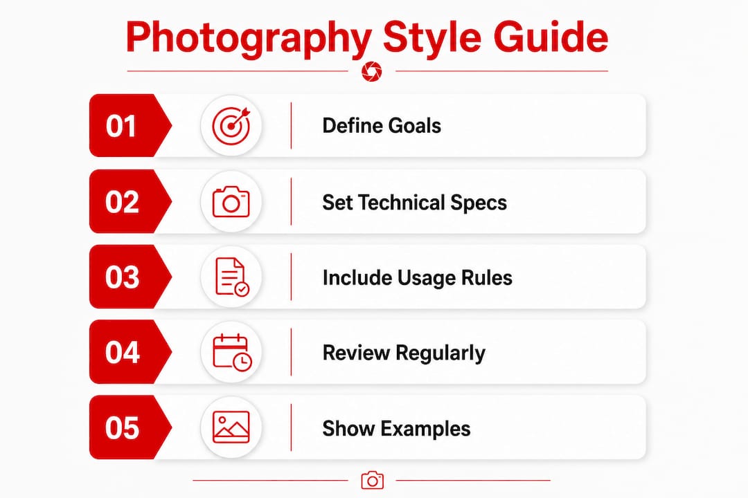
Pro Tip: Include a “before and after” image example in your style guide. Showing a non-compliant photo next to a compliant one removes all ambiguity and speeds up photographer onboarding significantly.
How do you coordinate production for consistent imagery across multiple offices?
Logistics are where most multi-location photography programs break down. You can have a perfect style guide and still end up with wildly inconsistent results if the production process is not managed with the same rigor. Here is a practical sequence for coordinating shoots across multiple sites:
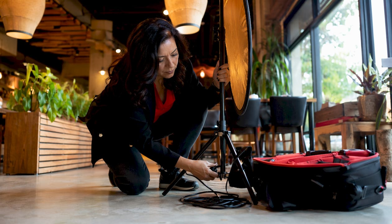
- Scout and approve locations in advance. Office fluorescent lighting and mixed light sources create serious white balance challenges. Select controlled environments or standardize the use of portable lighting kits across all offices.
- Issue a wardrobe brief to every participant. Coordinated color palettes allow individual style within brand parameters. Specify which colors are approved, which are prohibited, and whether branded attire is required.
- Run a test shoot at one location first. Use the output to calibrate your style guide and identify any gaps before rolling out nationally. A single test shoot saves weeks of post-production corrections later.
- Brief every photographer with the same document. Send the style guide, a shot list, and a reference image sheet at least one week before each shoot date. Follow up with a 30-minute call to answer questions.
- Assign a brand point-of-contact at each location. This person confirms wardrobe compliance, manages participant scheduling, and flags any location issues before the photographer arrives.
Environmental corporate portraits convey authenticity and operational context. They often perform better on social media than staged studio portraits. If your brand uses environmental settings, document the approved environment types so each location team selects a space that fits the same visual language.
Pro Tip: Ship a portable lighting kit to each location rather than relying on local conditions. A consistent light source is the single fastest way to unify images shot in different cities.
How does Digital Asset Management sustain photo consistency over time?
A centralized Digital Asset Management system, known as a DAM, is the operational backbone of long-term photo consistency. Without one, approved images get buried in email threads, outdated photos stay in circulation, and regional teams pull whatever they can find. A DAM solves all three problems at once.
Key practices for running an effective DAM program:
- Standardize file naming conventions. Use a format that includes location, date, subject, and approved use. Example: “CHI_2026_SmithJ_LinkedIn.jpg” is searchable and self-explanatory.
- Set permission levels by role. Marketing managers get full access. Regional coordinators get access to their location’s assets only. External agencies get access to approved campaign images only.
- Tag every asset with usage metadata. Include platform, expiration date, and the style guide version it was produced under. This prevents outdated images from being used after a rebrand.
- Create a feedback channel. Give marketing and creative teams a direct way to flag non-compliant images or request replacements. Unresolved quality issues compound over time.
Integrating photography analytics into your DAM workflow adds another layer of accountability. Tracking which images drive the most engagement on LinkedIn or your website tells you which visual styles are working and which need to be refreshed. That data feeds directly back into your next style guide review.
What are the most common challenges in maintaining photo consistency nationwide?
Even well-prepared brands hit obstacles when executing photography across multiple locations. Knowing the most common failure points helps you build contingencies before they become problems.
- Inconsistent color grading across photographers: Different cameras and editing software produce different color profiles. Solve this by providing a shared Lightroom or Capture One preset to every photographer on the project.
- Varying skill levels among local photographers: Not every city has the same talent pool. Vet photographers with a paid test shoot before committing to a full session. Review their output against your style guide before approving them.
- Budget pressure leading to quality shortcuts: Cutting the lighting kit or skipping the test shoot saves money in the short term and costs far more in reshoots. Professional photos on your website directly affect how clients perceive your brand’s credibility. Treat photography as a brand infrastructure cost, not a discretionary expense.
- Incomplete shoot participation: Employees miss scheduled sessions. Build a makeup shoot date into every location’s timeline and communicate it in the initial briefing.
Pro Tip: Create a post-production checklist that every photographer must complete before submitting final files. Include white balance verification, crop confirmation, and retouching standards. This single step catches most inconsistencies before images reach your DAM.
For a deeper look at standardizing employee headshots across offices, the process maps directly onto these troubleshooting principles.
Key Takeaways
Maintaining uniform corporate photography requires a documented brand art direction system, a practical style guide, disciplined production logistics, and a centralized DAM to prevent visual drift across every location.
| Point | Details |
|---|---|
| Brand art direction is the foundation | Document lighting, framing, color grading, and casting rules before any shoot begins. |
| Style guides must serve multiple audiences | Write separate sections for photographers, marketers, and content teams to improve adoption. |
| Production logistics determine real-world results | Standardize locations, wardrobe, and lighting kits across all offices to prevent inconsistency. |
| DAM systems protect long-term consistency | Centralize approved assets with permission levels, naming conventions, and expiration tags. |
| Reviews prevent visual drift | Audit your style guide every 12 months or after any brand positioning change. |
Why photography is brand infrastructure, not a project
I’m Traci Schowmeyer, and the most consistent mistake I see corporate brands make is treating photography as a campaign deliverable rather than a standing system. A brand will invest months in a rebrand, update the logo, refresh the website, and then shoot new headshots once. Two years later, half the team has been replaced and the new photos look nothing like the originals. The brand’s visual identity quietly falls apart.
The brands that get this right treat photography the way they treat their logo usage rules. The standards are written down, distributed to every relevant team, and reviewed on a schedule. Distributed teams actually follow guidelines when those guidelines are clear, specific, and easy to access. Vague direction produces vague results.
What I’ve found is that the ROI argument for consistent corporate headshots becomes obvious the moment a brand calculates the cost of reshoots, off-brand assets in circulation, and lost credibility with clients who notice the inconsistency. Proactive investment in a photography system is almost always cheaper than reactive damage control. Build the system once, maintain it consistently, and your brand imagery will compound in value over time.
— Traci Schowmeyer
Consistent corporate photography, wherever your team works
Maintaining brand alignment across multiple offices requires more than a style guide. It requires a photography partner who understands how to execute consistently at scale.
Metroplex Headshots specializes in national corporate headshot programs designed to deliver the same quality, lighting, and brand feel whether your team is in Dallas, Denver, or New York. From style guide development to multi-location shoot coordination, the process is built to protect your brand’s visual identity at every step. If you want to see what cohesive corporate photography looks like in practice, explore cohesive corporate photography styles that translate across platforms and teams.
FAQ
What is corporate photo consistency across locations?
Corporate photo consistency across locations is the practice of applying uniform visual standards, including lighting, framing, color grading, and wardrobe, to all photography produced across every office or region a company operates in.
Why does brand art direction matter for multi-location photography?
Brand art direction provides the documented rules that keep photography consistent when multiple photographers work across different cities. Without it, visual drift occurs as each photographer defaults to their own style.
How do I prevent color inconsistency across photographers?
Provide every photographer with a shared editing preset in Lightroom or Capture One and require white balance verification before final file submission. This eliminates the most common source of color variation.
What should a corporate photography style guide include?
A style guide should cover lighting setup, mood and expression direction, approved backgrounds, platform-specific crop ratios, and wardrobe guidelines, written separately for photographers, marketers, and content teams.
How often should a photography style guide be updated?
Review your style guide every 12 months or immediately after any brand repositioning. Regular reviews prevent outdated visual standards from undermining current brand strategy.

