

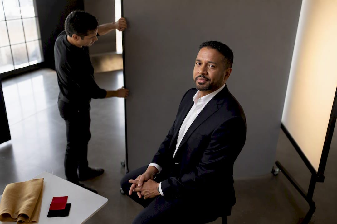
The best LinkedIn photo background is a neutral light gray, since it flatters most skin tones and holds up well when LinkedIn shrinks your photo into a small circular thumbnail. Soft blurred office and soft blue are the two safest alternates. The rule that governs all of it: your face has to win against the backdrop, not blend into it. This guide covers profession-specific choices, on-set checks, AI editing tradeoffs, and a checklist you can hand your photographer.
TL;DR:
- Neutral light gray remains the safest and most flattering background, especially for small LinkedIn thumbnail crops and most skin tones.
- Blue and blurred office backgrounds are modern, approachable, and industry-specific, but cluttered or saturated colors should be avoided.
- Confirm thumbnail clarity, edge lighting, wardrobe contrast, and background flatness before the shoot to prevent issues in final images.
- Studio seamless gray backdrops are the most consistent, lasting option, while environmental settings provide authenticity but may look dated faster.
- Use AI background swaps only for minor edits or quick tests, and prioritize reshoots for lighting, wardrobe, or brand-specific environmental needs.
Table of Contents
- Which LinkedIn Photo Background Is Actually Safe to Use?
- How Do You Match a Background to Your Industry and Skin Tone?
- What Should You Check On-Set Before the Session Ends?
- Studio Backdrops vs. Environmental Settings: What’s the Tradeoff?
- Should You Use an AI Background Swap or Book a Reshoot?
- What Belongs on Your Pre-Shoot Executive Checklist?
- Why Background Choice Is a Brand Decision, Not a Styling One
- Book a Session That Gets the Background Right the First Time
- Sources
Which LinkedIn Photo Background Is Actually Safe to Use?
Not every backdrop survives the trip from a photographer’s monitor to a LinkedIn thumbnail. Here’s the shortlist that does, ranked by how often it works.
- Neutral light gray: the default for good reason. It’s the safest, most universally flattering background across skin tones and industries, and it reads cleanly even when LinkedIn crops your photo down to a small circle.
- Soft blurred office: modern and approachable, especially for client-facing roles. Shot with shallow depth of field, it communicates real workspace without competing with your face.
- Soft blue: this one signals trust, which is why it shows up so often for healthcare providers, sales professionals, and consultants.
- Charcoal or navy: authority in a color. Executives, finance professionals, and attorneys lean on dark backdrops to project weight and seriousness.
- Off-white or clean white: useful when files need to be cut out later or for casting-style submissions, but it’s less forgiving on lighting mistakes than gray.
Avoid cluttered backgrounds, visible logos, and saturated colors. They pull attention away from your face exactly where LinkedIn gives you the least room to spare.
How Do You Match a Background to Your Industry and Skin Tone?
Certain professions have unwritten dress codes for backdrops, and ignoring them makes a photo feel slightly off even when nobody can say why. Attorneys and finance professionals tend toward gray or navy, since both project stability. Healthcare and education professionals often do better with soft blue, which reads as calm and trustworthy. Real estate agents and sales professionals benefit from the soft office look because it hints at accessibility. Creative professionals have more room to experiment, sometimes with a measured bold color or even black, but that flexibility doesn’t extend to conservative industries.
Skin undertone matters just as much as profession. A quick vein test on your wrist helps: greenish veins usually mean warm undertones, blue or purple veins mean cool undertones, and a mix means neutral.
- Cool undertones generally pair well with charcoal, navy, or soft blue.
- Warm undertones tend to look best against light gray or warm-toned off-white.
- Neutral undertones have the most flexibility and can move between gray, blue, and blurred office backgrounds without issue.
One rule holds regardless of undertone: keep contrast between your hair, your clothing, and the backdrop so your shoulders stay visible inside LinkedIn’s circular crop. LinkedIn displays photos small across the platform, and busy or low-contrast backgrounds turn into visual noise at that size.
What Should You Check On-Set Before the Session Ends?
A background can look great on a photographer’s full-size monitor and still fall apart once LinkedIn compresses it into a thumbnail. Confirm these before you leave the studio:
- Preview at thumbnail size. Pull the image up small and inside a circular crop mockup, not just full screen, and check that your face still reads clearly.
- Watch the edges. Rim or edge lighting separates dark hair from a charcoal or navy backdrop; without it, hair and background merge into one dark mass.
- Check for flatness on white. A pure white backdrop needs enough light shaping to avoid a washed-out, shadowless look.
- Confirm wardrobe contrast. If your jacket or blouse is close in tone to the backdrop, your shoulders disappear into it. Avoid matching the backdrop color on purpose.
- Request real-time review. Ask to see images as they’re captured, and get at least one unedited native file along with your edited variants for comparison.
Pro Tip: Bring two outfit options with different tones. If your first choice turns out too close to the backdrop once you see it on screen, you’ll have a backup ready instead of reshooting later. For more on outfit planning, this dressing guide for professional photos covers contrast rules in more depth.
Studio Backdrops vs. Environmental Settings: What’s the Tradeoff?
Backdrops generally fall into four categories: solid seamless paper, gradient or painted canvas, environmental (blurred real-world settings), and branded setups. Each one carries different costs, consistency levels, and shelf life.
- Studio seamless gray is the workhorse. It’s consistent from session to session, fast to shoot, and ages well, which makes it the strongest option for directory photos and LinkedIn specifically.
- Gradient or painted canvas brings editorial polish and works especially well for executive portraits, but it costs more and demands precise subject placement, which makes it clunky for shooting a large team back to back.
- Environmental backgrounds add real authenticity, but a blurred office or cityscape dates faster than a neutral backdrop and carries operational risk like weather or venue access on location.
Plan around how long the photo needs to last. Most professional headshots stay current for three to five years, so weigh a trendy environmental shot against a neutral one that won’t look dated by year three.
Should You Use an AI Background Swap or Book a Reshoot?
AI background editing has a real place in this decision, just not an unlimited one. AI headshot tools let you test multiple studio-style backgrounds from a single photo, which makes them useful for quick neutral swaps or minor fixes after the fact.
- Accept an AI edit for a simple background swap, like turning an office backdrop into solid gray, or for small distractions in the corner of the frame.
- Prioritize any tool or vendor that can demonstrate skin-tone fidelity and natural shadow behavior; poor shadow matching is the fastest way to spot an edited photo.
- Reshoot instead when the problem is lighting, wardrobe, or expression. No editing tool fixes squinting or a wrinkled collar convincingly.
- Reshoot when your brand specifically needs an authentic environmental setting, since that context is hard to fabricate believably.
Pro Tip: Zoom into the edges around your hair and shoulders on any AI-edited image. Blending errors show up there first, especially at full resolution before LinkedIn compresses the file. Businesses exploring AI for brand visuals more broadly can find useful context in this guide to building a brand with AI.
What Belongs on Your Pre-Shoot Executive Checklist?
Handing your photographer a short brief saves time and prevents mismatched expectations on session day. Cover these points before you arrive:
- Your chosen backdrop option, plus one backup (gray as default, blue or blurred office as the alternate).
- A wardrobe plan that creates contrast against the backdrop rather than blending into it.
- Two preferred poses you want tested, not just one.
- A request for real-time image review during the session.
- Your retouching and background-editing preferences stated up front.
Also worth including:
- A one or two-line description of the impression you want the photo to convey (approachable, authoritative, warm) and who’s likely to see it.
- Confirmation that thumbnail and circular-crop checks happen before you leave.
Metroplex Headshots built its Executive Photo Checklist around exactly this kind of brief, covering backdrop choice, wardrobe contrast, and retouching preferences in one document you can send ahead of your session. Pairing it with pose guidance, like the options in this guide to LinkedIn photo poses, gives your photographer everything needed before the camera comes out.
Why Background Choice Is a Brand Decision, Not a Styling One
Background is a signal before it’s a style choice. Pick one default, most often light gray, and one contextual alternate that fits your industry, then stop second-guessing it. Metroplex Headshots builds its own recommendations around that same discipline. Bring your photographer a written brief using the checklist above, and confirm the thumbnail crop before you leave the session.
— Traci Schowmeyer
Book a Session That Gets the Background Right the First Time
Professional headshot sessions offer benefits over DIY photos or rushed office sessions, such as focus on getting the background right the first time, with real-time review to catch any mismatched backdrop before it becomes your final file. This can include options like studio light gray for a safe universal choice, on-location environmental sessions when the brand calls for it, and professional retouching or background editing handled by a photographer.

When booking a session, it is advisable to ask about session length, turnaround time, how many retouched images are included, and whether a mobile studio setup is available for an office or team. Compare your options for studio sessions versus environmental portraits to figure out which fits your industry and timeline, then get your session scheduled before your current LinkedIn photo gets any older.
Sources
- Best background color for profile picture: A tested guide — ProfileBakery
- Professional headshot background: How to pick (2026) — Imagera AI
- Headshot background and backdrop selection guide (2026) — Tov Studio Photo

