Your headshot background is a branding decision, not a decoration choice. Before a viewer reads your name or registers your expression, their brain has already formed a judgment based on color and visual context. Snap assessments of competence rely on color and initial visual impressions between 62% and 90% of the time, often within 100 milliseconds. That means why background choice headshot matters is not a stylistic question. It is a credibility question. The background you choose signals your industry fit, your authority level, and your brand personality before you say a single word.
Why background choice in your headshot shapes first impressions
The background in your professional portrait functions as a silent context cue. Viewers use it to categorize you before they consciously process anything else. A cluttered background reads as disorganized. A stark white background can feel clinical or cold. A thoughtfully chosen neutral or setting communicates that you understand your professional environment and take your image seriously.
This is the core principle behind headshot color psychology: every visual element in a portrait carries subconscious weight. The background is not neutral unless you make it intentionally neutral. Even a plain gray backdrop communicates something, and what it communicates depends entirely on the shade, the lighting, and whether it aligns with your brand.

LinkedIn profiles, corporate websites, and marketing materials all display your headshot in contexts where your audience is making fast decisions. A well-chosen background reinforces your message in all three places. A mismatched one creates visual drift, a subtle disconnect between what you say about yourself and what your image communicates.
How background color psychology shapes perception
Color is the first variable your viewer processes. Blue tones signal trust and competence, with navy conveying authority and lighter blues suggesting approachability. This is why financial advisors, attorneys, and executives frequently appear in front of deep blue or navy backdrops. The color does part of the credibility work before the viewer reads a single credential.
Gray has long been the default choice in professional photography, and it remains a solid option when used with intention. The 2026 trend, however, is moving away from light gray toward darker grays and charcoals that frame the face more dramatically and add gravitas without the harshness of black. This shift reflects a broader move in professional branding toward images that feel distinctive rather than generic.
Red backgrounds carry risk. Red signals energy and dominance, which can work in certain contexts, but it also reads as aggressive or confrontational in conservative industries. White backgrounds are clean and modern but require precise lighting to avoid a flat, editorial look that feels more like a passport photo than a professional portrait.
Pro Tip: If you are unsure which color serves your brand, look at the headshots of three or four respected peers in your industry. The background patterns you see repeated are not accidental. They reflect the visual language your audience already trusts.
Here is a quick reference for color associations in professional headshots:
- Navy and deep blue: Authority, trust, financial and legal sectors
- Charcoal and dark gray: Gravitas, executive presence, corporate environments
- Light gray: Neutral versatility, widely used but increasingly generic
- Warm beige and taupe: Approachability, warmth, coaching and wellness fields
- Green tones: Growth, health, sustainability-focused brands
- White: Clean and modern, but technically demanding to execute well
Background types compared: which works for your industry?
Not every professional needs the same backdrop. The best backgrounds for headshots depend on your role, your audience, and the platforms where your image will appear. The table below compares the four most common background types and their ideal use cases.
| Background type | Best fit | What it communicates |
|---|---|---|
| Solid dark neutral (navy, charcoal) | Finance, law, executive leadership | Authority, stability, executive presence |
| Blurred office or workspace | Tech, corporate, consulting | Approachable expertise, professional context |
| Outdoor natural setting | Real estate, coaching, creative fields | Warmth, character, accessibility |
| Textured or branded color wash | Design, marketing, creative industries | Personality, creativity, brand alignment |
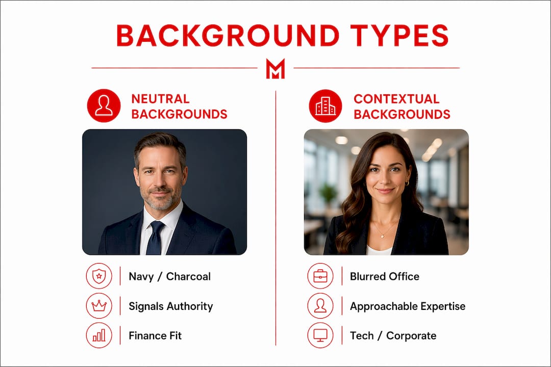
Blurred office backgrounds convey approachable expertise and are the preferred choice in tech and corporate sectors. The blurred workplace image adds context without competing with your face. It says, “I work in a professional environment,” without turning the background into a distraction.
Outdoor headshots offer natural light and depth that studio settings cannot fully replicate. Real estate agents, life coaches, and client-facing consultants often benefit from this approach because natural settings reinforce the warmth and accessibility their clients expect. The key is choosing a location that feels intentional, not accidental.
Creative professionals have the most flexibility. A textured backdrop or a branded color wash can reinforce a design studio’s aesthetic or a marketing consultant’s personality. The risk is tipping from distinctive into distracting. The background should complement your face, not compete with it. As research confirms, a background that competes visually with your face diminishes the effectiveness of your entire headshot.
For guidance on how attire interacts with your background choice, the what to wear for a headshot guide at Metroplex Headshots covers the full picture.
Common mistakes professionals make with headshot backgrounds
The most common mistake is choosing a background without intent. Generic gray backgrounds often produce forgettable headshots that lack distinctiveness. When every professional in your field uses the same light gray backdrop, your image blends into the crowd rather than standing out from it. Playing it safe is not the same as making a smart choice.
Here are the four most damaging background mistakes professionals make:
- Defaulting to light gray without considering alternatives. Light gray is not wrong, but it is rarely the strongest option. If you choose it, choose it deliberately, not because it was the only backdrop in the studio.
- Using a busy or distracting background. Bookshelves, office clutter, or heavily patterned walls pull the viewer’s eye away from your face. The background’s job is to support your expression, not compete with it.
- Mismatching background to professional role. A criminal defense attorney photographed against a casual outdoor setting creates a credibility gap. A wellness coach photographed against a stark corporate gray misses a warmth opportunity. Brand alignment requires that your background reflects your actual professional context.
- Ignoring lighting. Proper lighting is fundamental. A great background with poor lighting produces a bad headshot. The inverse is also true. Lighting and background work together, and neither can compensate for a failure in the other.
Pro Tip: Before your session, bring a reference image of a headshot you admire from someone in your industry. Show it to your photographer. That single image communicates more about your goals than a five-minute description.
How to choose the right headshot background for your brand
Choosing a background is a four-step decision, not a single choice you make in the studio on the day of your shoot.
Step 1: Define your professional goal for the image. Are you positioning yourself as an authority, building approachability, or signaling creativity? Your answer narrows the color palette and setting type immediately.
Step 2: Match background to industry norms and platform context. A headshot used on a law firm’s website carries different expectations than one used on a personal coaching Instagram profile. Consider where the image will live and what your audience expects to see in that context. The 2026 shift in professional branding is moving toward role-specific visuals that reflect genuine professional identity rather than generic studio defaults.
Step 3: Discuss lighting and setup with your photographer before the session. The background color you choose in a catalog looks different under studio lighting than it does in the final image. A professional photographer will show you how a backdrop renders under their specific lighting setup. Do not skip this conversation.
Step 4: Consider post-shoot editing options. Background replacement technology has improved significantly. If your session produces a strong portrait but the background feels off, a skilled retoucher can swap it cleanly. This is not a substitute for getting it right in camera, but it is a legitimate option when circumstances limit your choices.
For a complete preparation framework, the professional headshot session guide at Metroplex Headshots walks through every decision point, from background selection to wardrobe to expression coaching.
The headshot photo examples page is also worth reviewing before your session. Seeing how background choices play out across different industries and roles gives you a concrete reference point that abstract advice cannot match.
Key takeaways
The background in your professional headshot is a brand alignment decision that shapes how viewers assess your credibility, authority, and approachability within the first 100 milliseconds of seeing your image.
| Point | Details |
|---|---|
| Color drives snap judgments | Between 62% and 90% of competence assessments rely on color and visual cues before expression or attire register. |
| Match background to industry | Dark neutrals suit finance and law; blurred office settings work for tech; outdoor settings fit client-facing roles. |
| Avoid the default gray trap | Generic light gray backgrounds create forgettable images. Choose your backdrop with deliberate intent. |
| Lighting and background are inseparable | A strong background choice fails without proper lighting. Address both in your session planning. |
| Platform context shapes the right choice | LinkedIn, corporate websites, and marketing materials each carry different audience expectations for your headshot. |
My honest read on where headshot backgrounds are heading in 2026
I’m Traci Schowmeyer, and I have watched the professional headshot conversation shift dramatically over the past few years. For a long time, the default advice was simple: go with a neutral gray, keep it clean, and let your face do the work. That advice was not wrong. It was just incomplete.
What I see now is that professionals are finally treating their headshot background the way they treat their website design or their LinkedIn headline. It is a brand decision. The 2026 trend away from default gray toward intentional, role-specific backgrounds is not a style fad. It reflects a deeper understanding that every visual element in your professional presence either reinforces your brand or dilutes it.
The clients who come to Metroplex Headshots with a clear sense of what they want their image to communicate almost always leave with stronger results. Not because they picked a trendier color, but because that clarity carries through into their expression, their posture, and the overall energy of the portrait. The background choice is often the first decision that forces that clarity.
My advice: stop treating the background as an afterthought you sort out when you arrive at the studio. Decide what you want your image to say, then work backward to the background that supports that message. That is the secret sauce of professional branding, and it applies to every element of your headshot, starting with what is behind you.
— Traci Schowmeyer
How Metroplex Headshots helps you get the background right
Getting your headshot background right requires more than picking a color from a swatch. It requires understanding how that color renders under professional lighting, how it interacts with your skin tone and attire, and whether it aligns with the impression you need to make in your specific industry.

Metroplex Headshots specializes in exactly this kind of intentional, brand-aligned portrait work. Every session includes a background consultation tailored to your professional goals, your industry, and the platforms where your image will appear. Whether you need a corporate headshot that signals executive presence or a client-facing portrait that leads with warmth and approachability, the team brings the expertise to execute it correctly. Explore session options and see how the right background transforms a good portrait into a powerful personal brand asset.
FAQ
Why does background color matter so much in a headshot?
Background color triggers subconscious judgments about competence and trustworthiness before viewers consciously process your expression or attire. Research shows these snap assessments rely on color and visual cues between 62% and 90% of the time.
What is the best background color for a professional headshot?
The best background color depends on your industry and goals. Navy and charcoal signal authority and work well in finance and law, while lighter neutrals and natural settings suit client-facing or creative roles.
Should I avoid gray backgrounds entirely?
Not entirely, but you should choose gray with intent rather than by default. Dark charcoal and gray tones are trending in 2026 for their ability to add gravitas, while generic light gray often produces forgettable results.
Can I change my headshot background after the shoot?
Yes. Background replacement through post-shoot editing is a legitimate option when the original backdrop does not serve your brand. It works best when the original lighting was clean and the subject was well-separated from the background.
How does my headshot background affect my LinkedIn profile?
Your LinkedIn headshot is often the first visual impression a recruiter, client, or colleague encounters. A background that signals professionalism and industry fit reinforces your profile’s credibility before a single word is read.